OVO Nabung
Turning an E-Wallet Ecosystem into a Banking Engine.
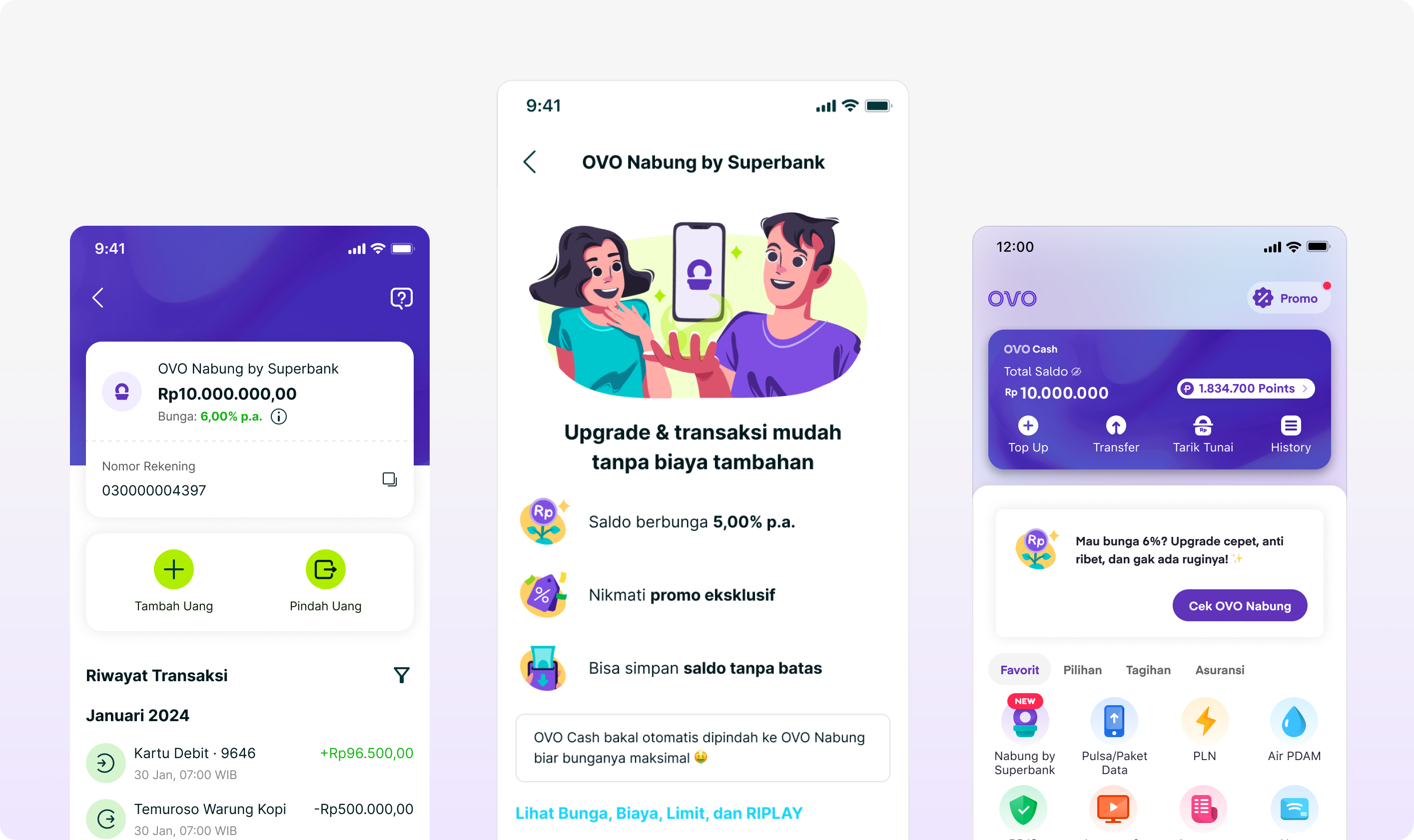
OVO had millions of active users. Superbank had zero.
Converting one into the other meant bridging two very different user expectations: the instant simplicity of an e-wallet and the regulatory weight of a licensed bank. That gap was our design problem.
First, intent. Most OVO users already had a primary bank. We weren't competing with other banks. We were competing with "I don't need this."
Second, friction. Bank registration is heavy by nature — KTP, personal data, 21 regulatory fields. Inside an app built for instant payments, this felt jarring. Users who had already decided to upgrade were dropping off not because they changed their mind, but because the experience stopped them.
Third, continuity. Onboarding was just the beginning. Payments and transaction history had to feel consistent across two separate apps with different systems and design languages. A disjointed post-onboarding experience would undo all the trust we built getting users there.
Making this harder, Superbank, Grab, and OVO each operated under different structures, priorities, and timelines. Regulatory approvals, evolving branding, and fragmented product surfaces added complexity on top of an already tight delivery schedule.
"How might we design a banking upgrade inside OVO that feels like a natural next step — not a whole new product?"
As Product Designer, I owned the end-to-end user journey within Superbank, collaborated with designers and stakeholders across Grab and OVO, translated regulatory and technical requirements into clear user flows, and ensured the experience was scalable for future ecosystem partners.
Defining CVP as the Conversion Engine
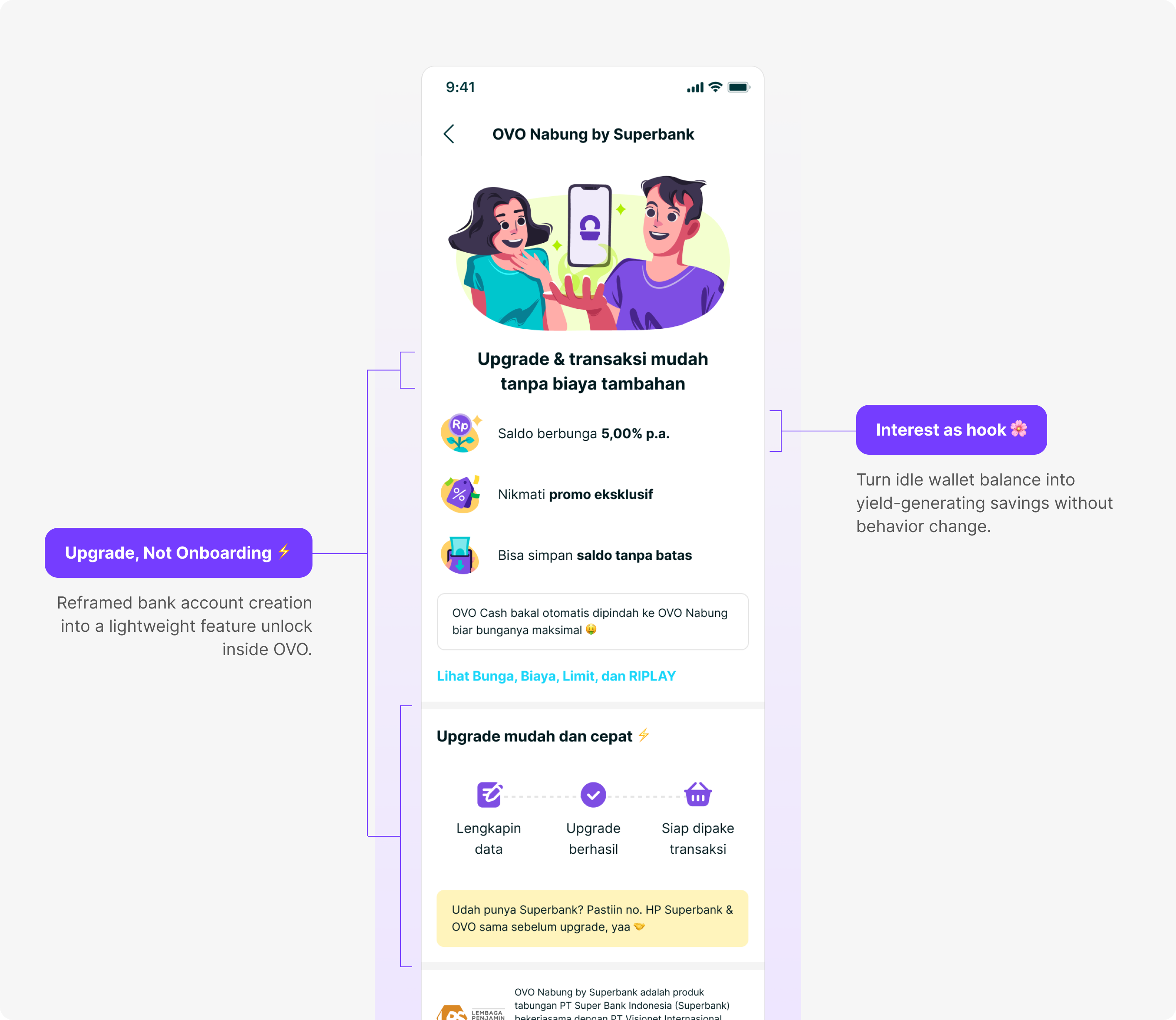
Converting passive OVO users into active Superbank customers came down to two levers working together.
The first was economic. Unlike a typical e-wallet, OVO Nabung lets users earn up to 5% interest on their idle balance, turning money that was just sitting there into something actively working for them. A concrete, immediate reason to upgrade that didn't require thinking long-term about banking.
The second was psychological. The biggest barrier in digital banking isn't the form — it's the perception of starting over. So we didn't frame it that way. We positioned the entire experience as an upgrade to something users already had — staying inside OVO's familiar environment, with existing data pre-filled, and Superbank introduced quietly in the background. The decision felt small. The value felt immediate.
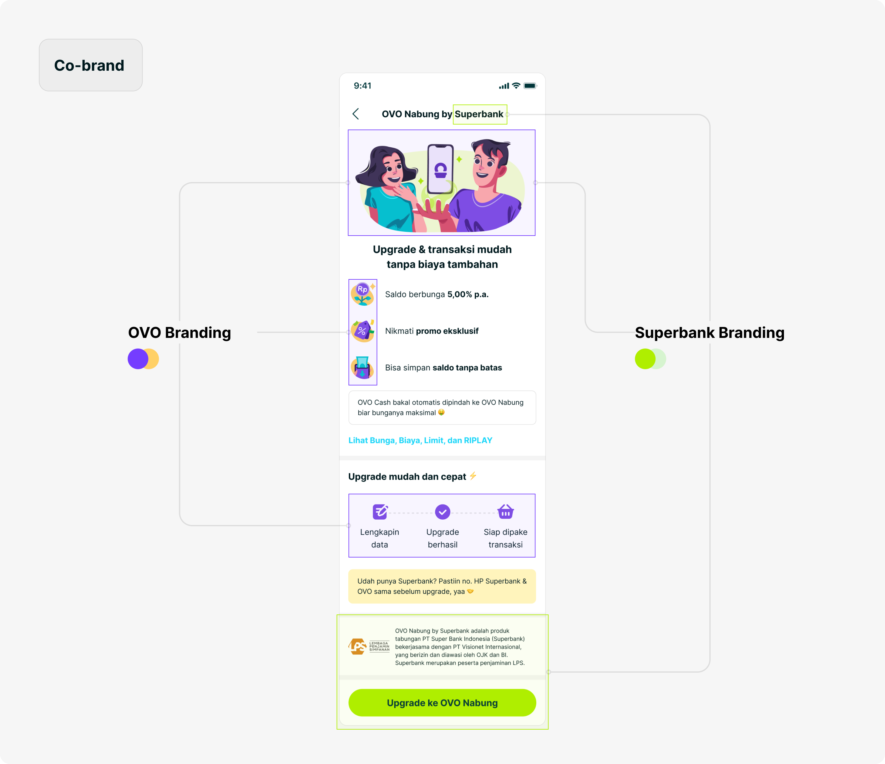
The co-branding reflected this: OVO remained the dominant presence throughout, with Superbank introduced in a subtle, supportive role as an evolution of OVO, not a migration away from it.
Minimizing Friction Without Compromising Compliance
Where the Journey Breaks
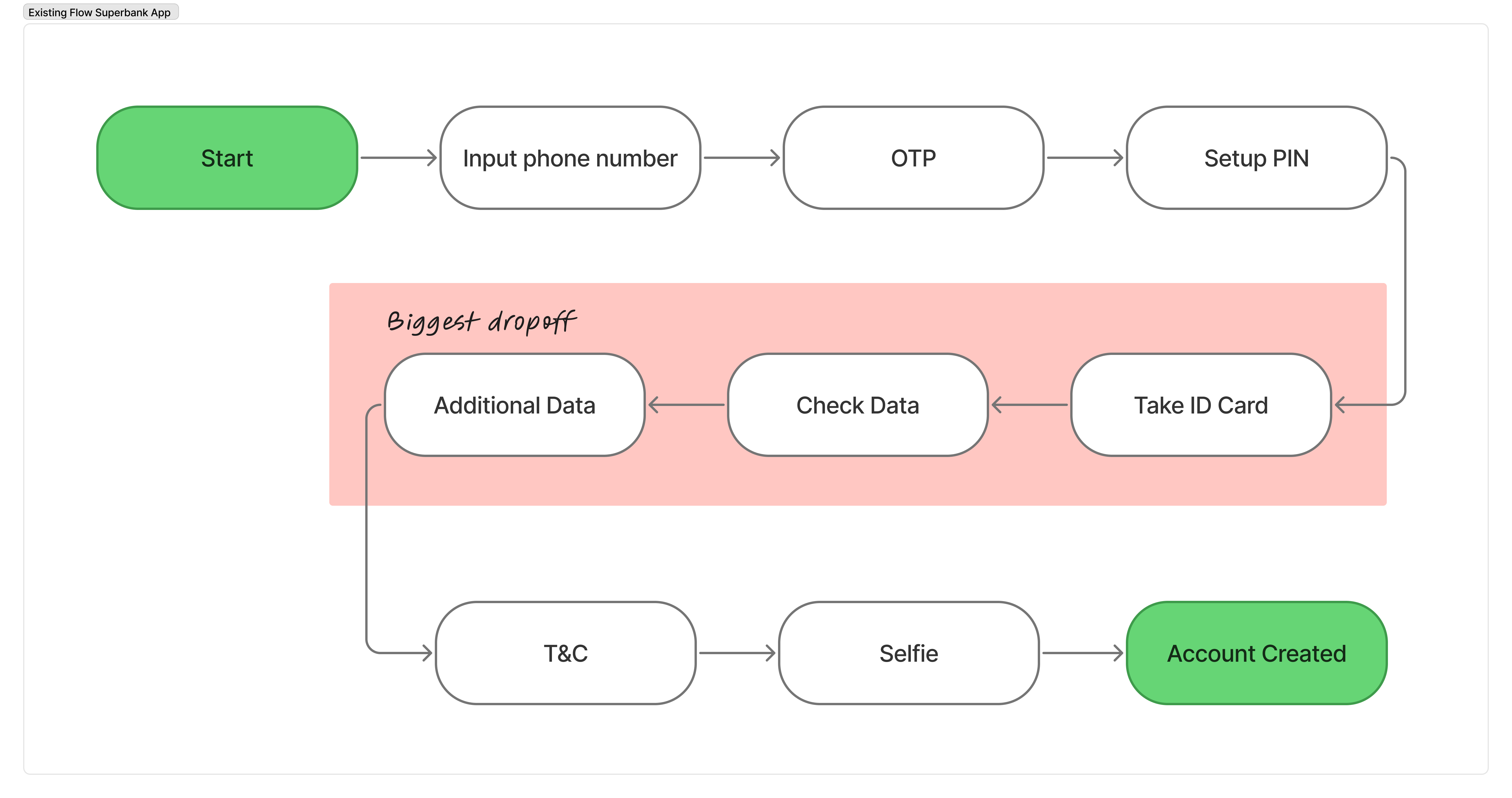
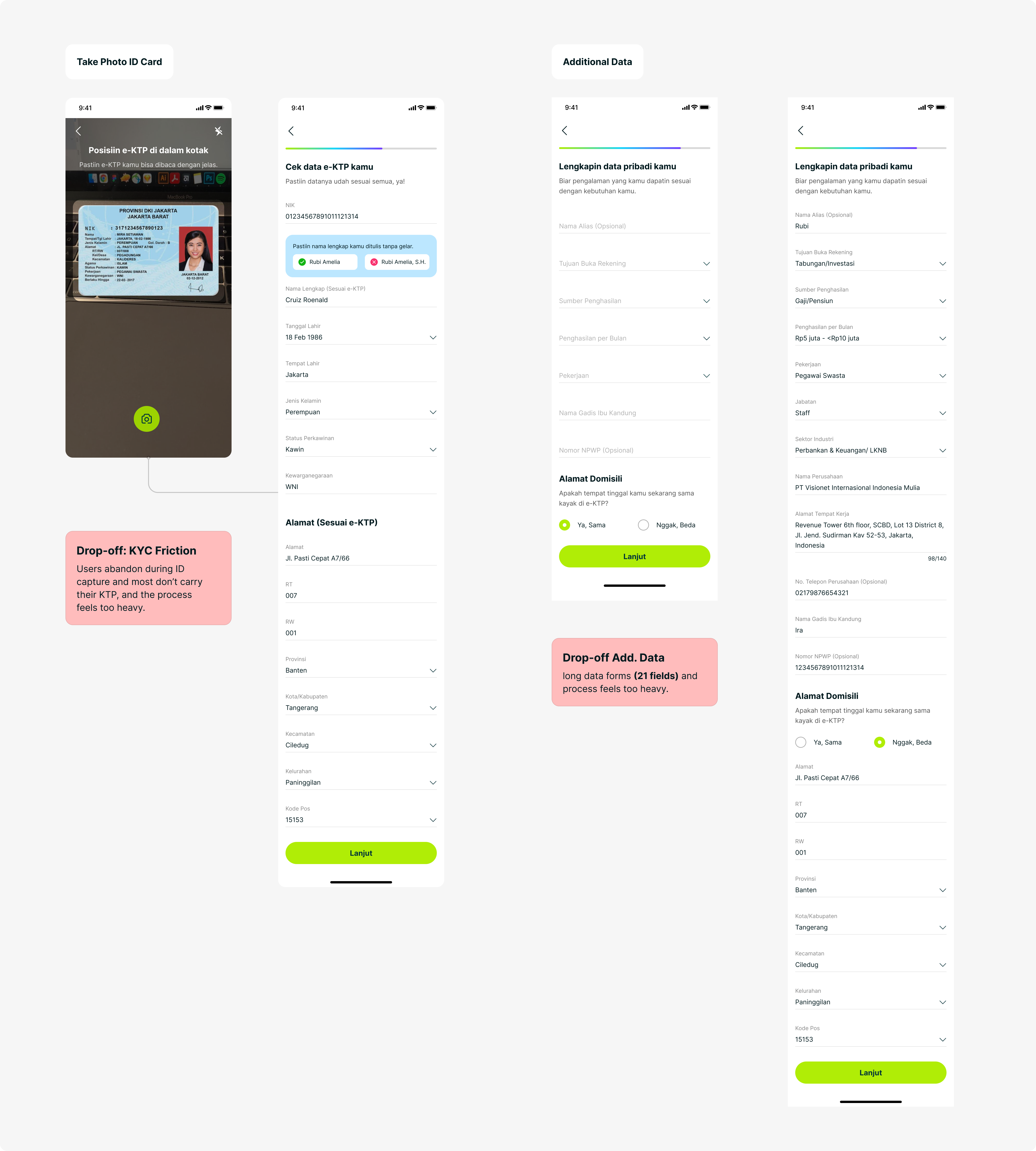
The biggest drop-off happened at the moment of highest intent. When users decided to open an account, they were immediately pushed into a full regulatory flow — separate KTP capture, data correction, and 21 additional fields. What should have felt like a simple upgrade became a heavy administrative task. This wasn't a problem of interest. It was friction at the most critical conversion point.
The Compliance Challenge
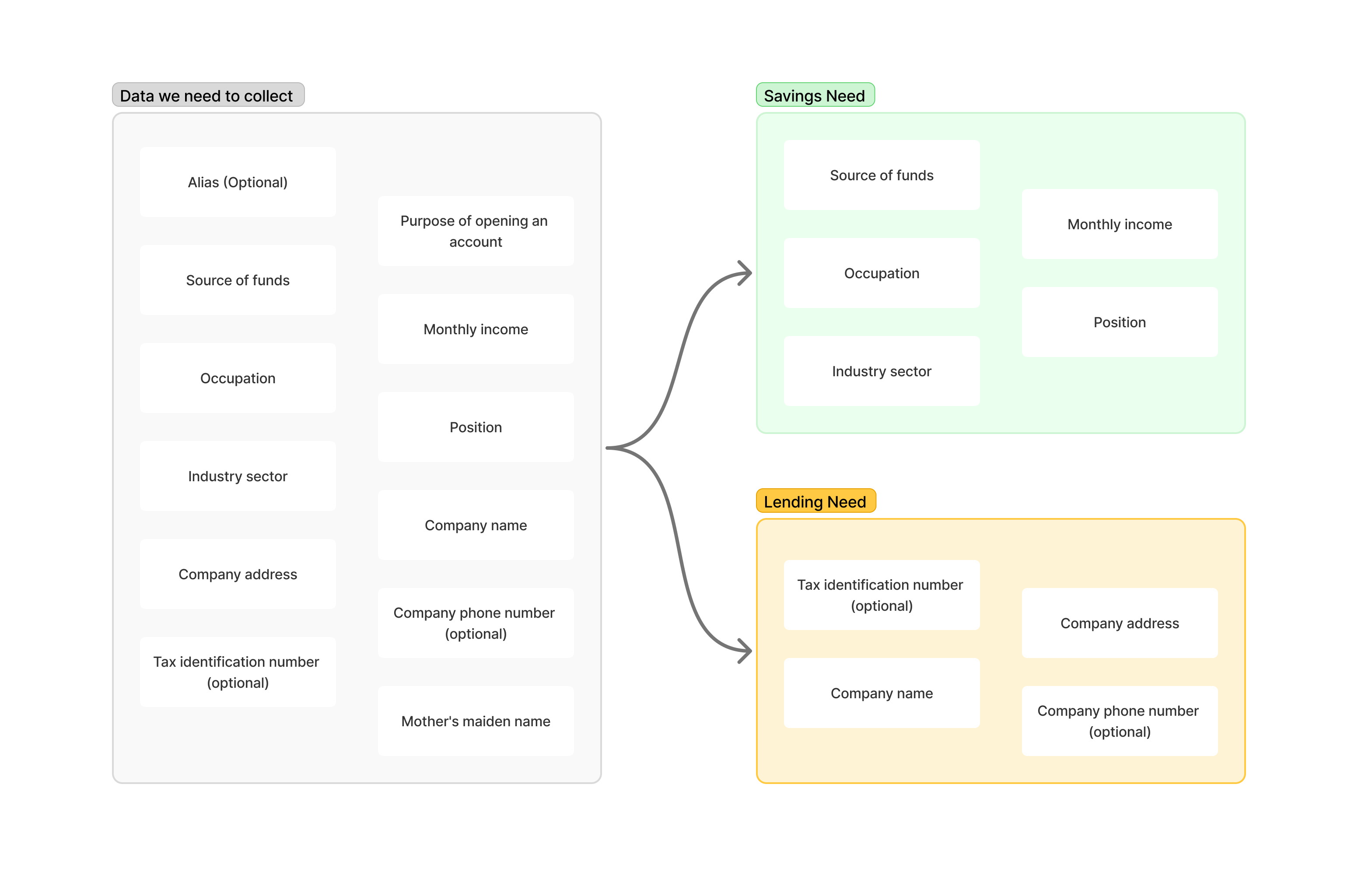
The compliance team required all 21 fields upfront. Splitting the flow meant users would exist in a partially-verified state — a regulatory concern.
I mapped each field to the product it actually served: some were required for savings (identity, address), others specifically for lending (income, source of funds, risk profiling). This gave us the legal basis for the split — framed as better compliance: collect lending data at the point of loan application, when it's actually needed.
"The result: permissive for savings, strict for lending."
Flow 1: Lite Upgrade (OVO App)
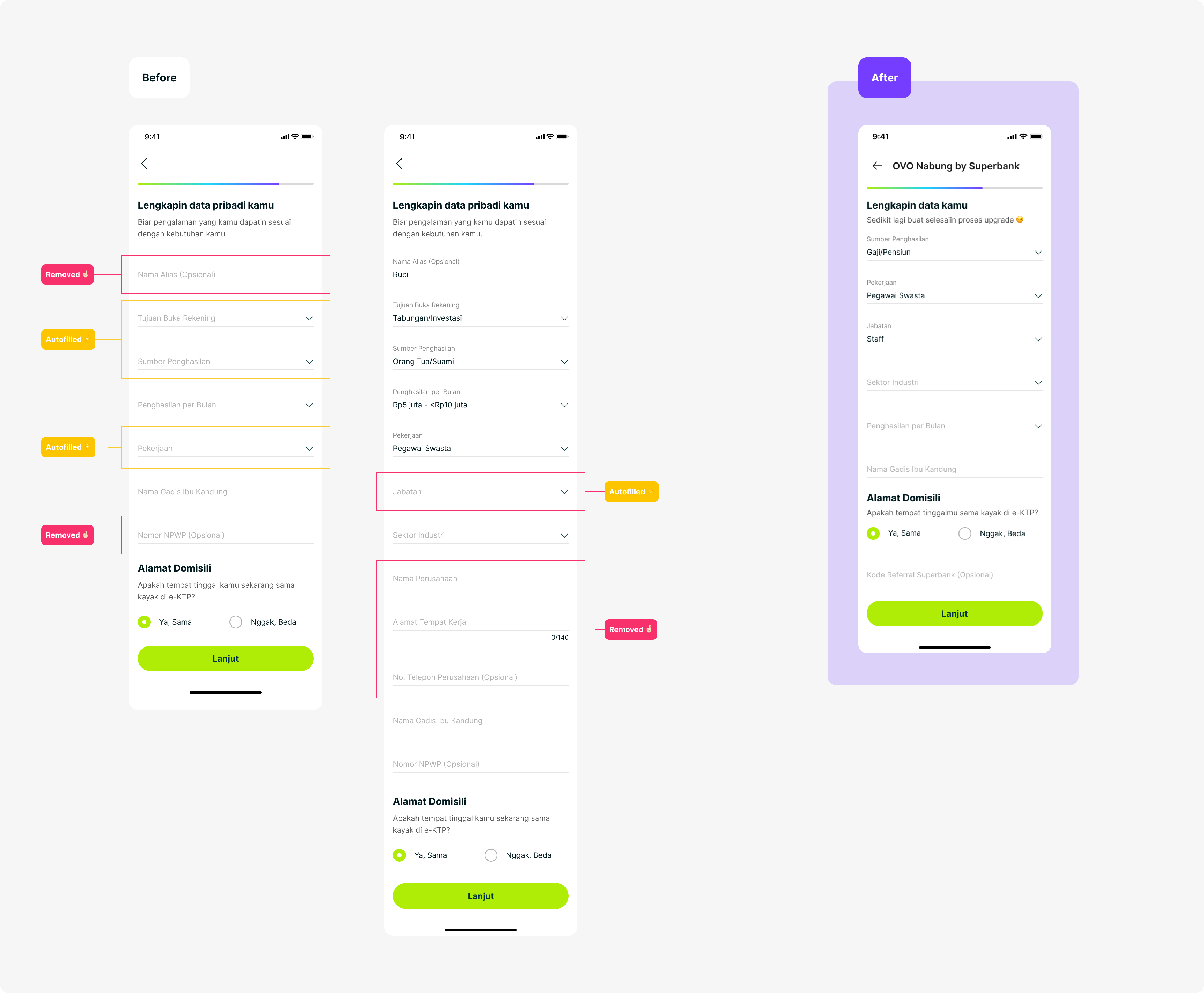

The first flow lives entirely within the OVO app. By leveraging OVO's existing KYC data, I reduced the registration form from 21 fields down to 3 — only collecting what Superbank needed that OVO didn't already have.
After completing just 3 fields, the user has an active OVO Nabung account. They can deposit, see their balance, and start earning interest. Value is unlocked before full compliance is complete.
Flow 2: Progressive Compliance (Superbank App)
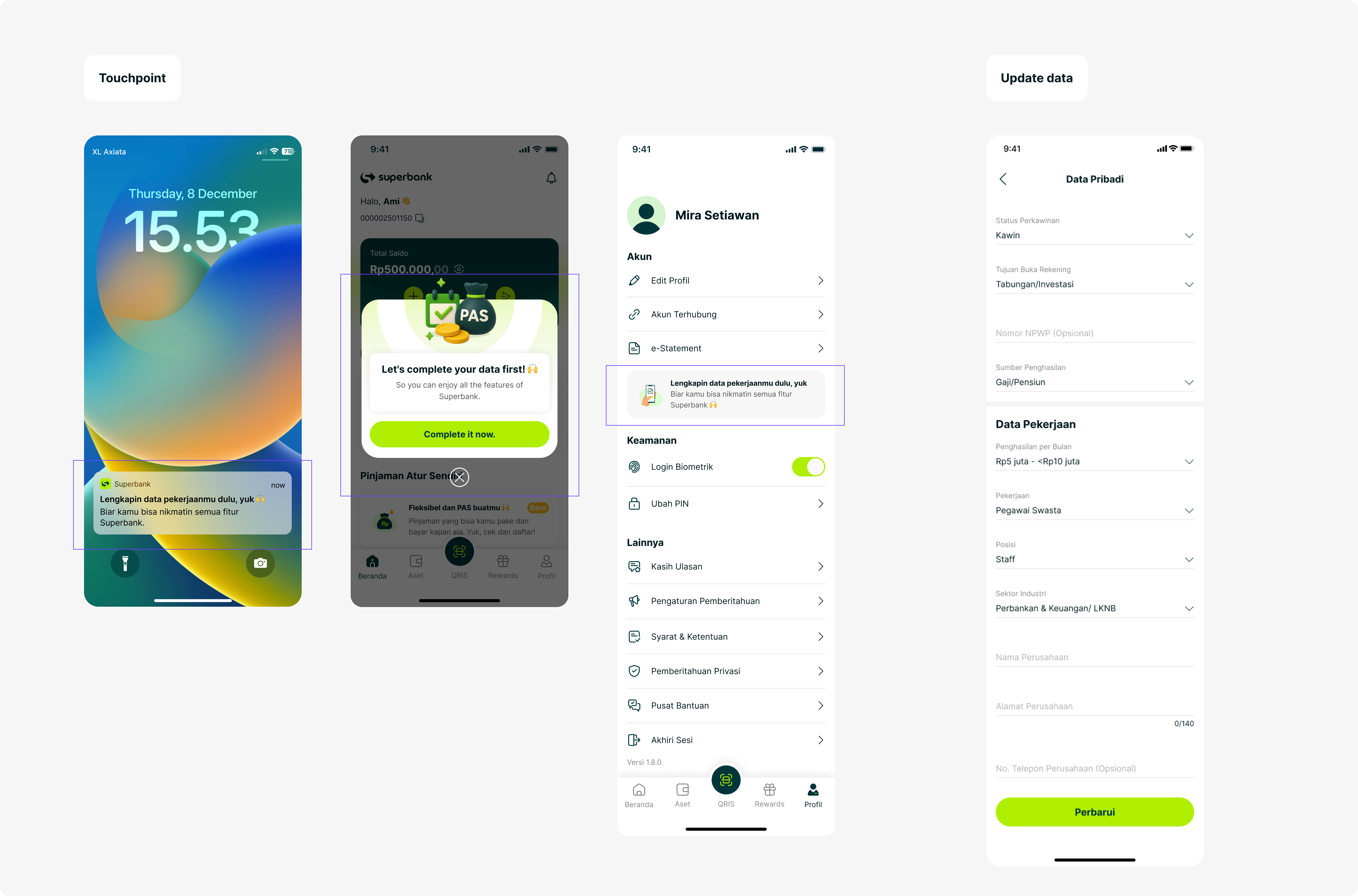
The remaining data — income, source of funds, risk profiling — is collected inside Superbank, triggered only when the user applies for a loan. Users who are ready to borrow are already high-intent, so the completion barrier drops dramatically. If they haven't verified yet, the flow requires it before the loan proceeds — not before they can access their savings.
Designing for Multi-Path User Journeys
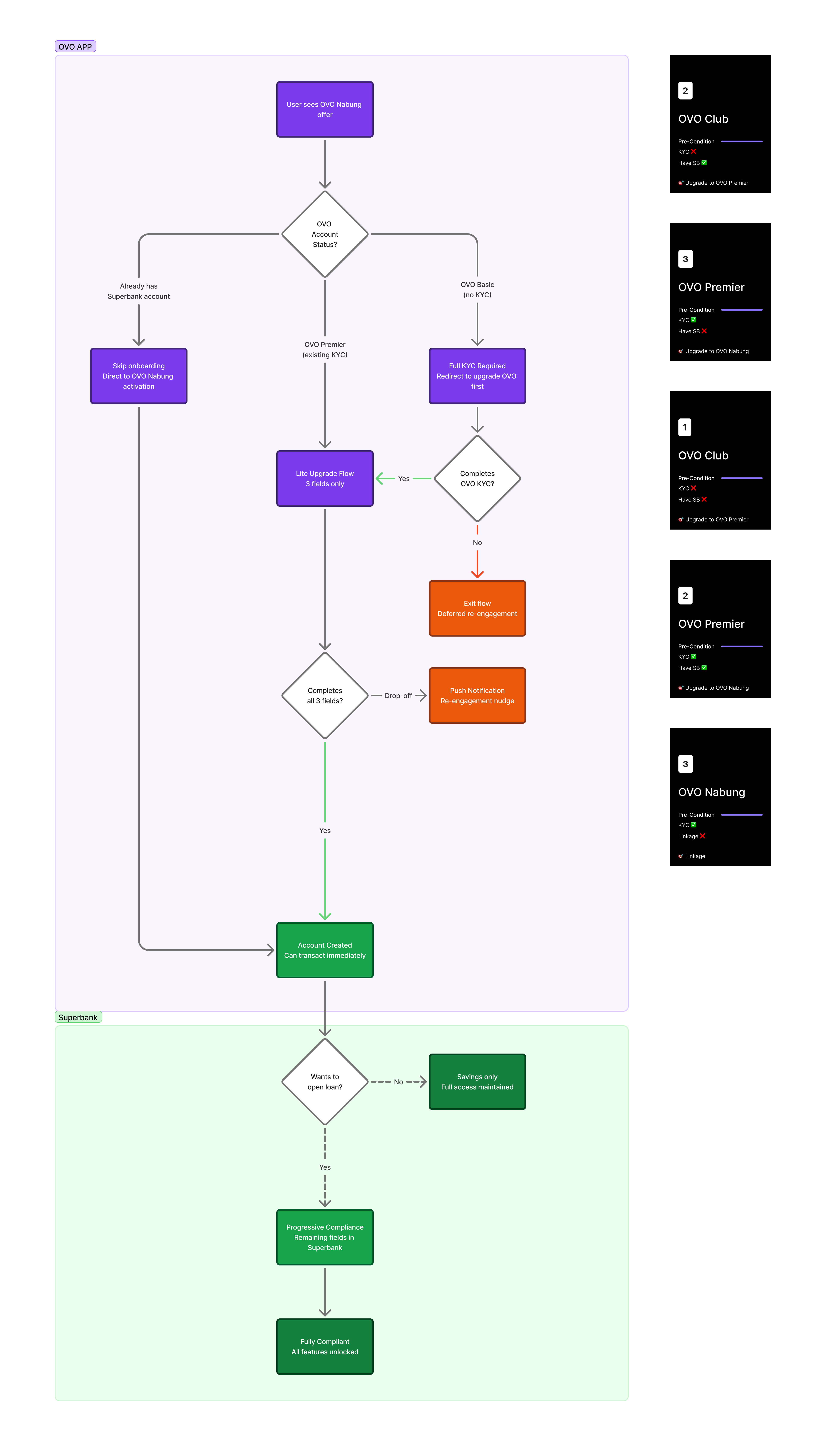
Savings account creation wasn't a single linear flow. I mapped every scenario across OVO and Superbank: new-to-bank users, returning drop-offs, users who already had a Superbank account, and edge cases like pocket creation mid-journey. Without this, we risked users landing in broken states — partially onboarded, unable to transact, with no clear path forward.
The mapping shaped three things directly: our fallback flow logic, push notification triggers for re-engagement, and the cross-app nudge strategy. The goal: no user should ever feel lost between OVO and Superbank, regardless of how they entered or where they stopped.
Integrating Payment Flow
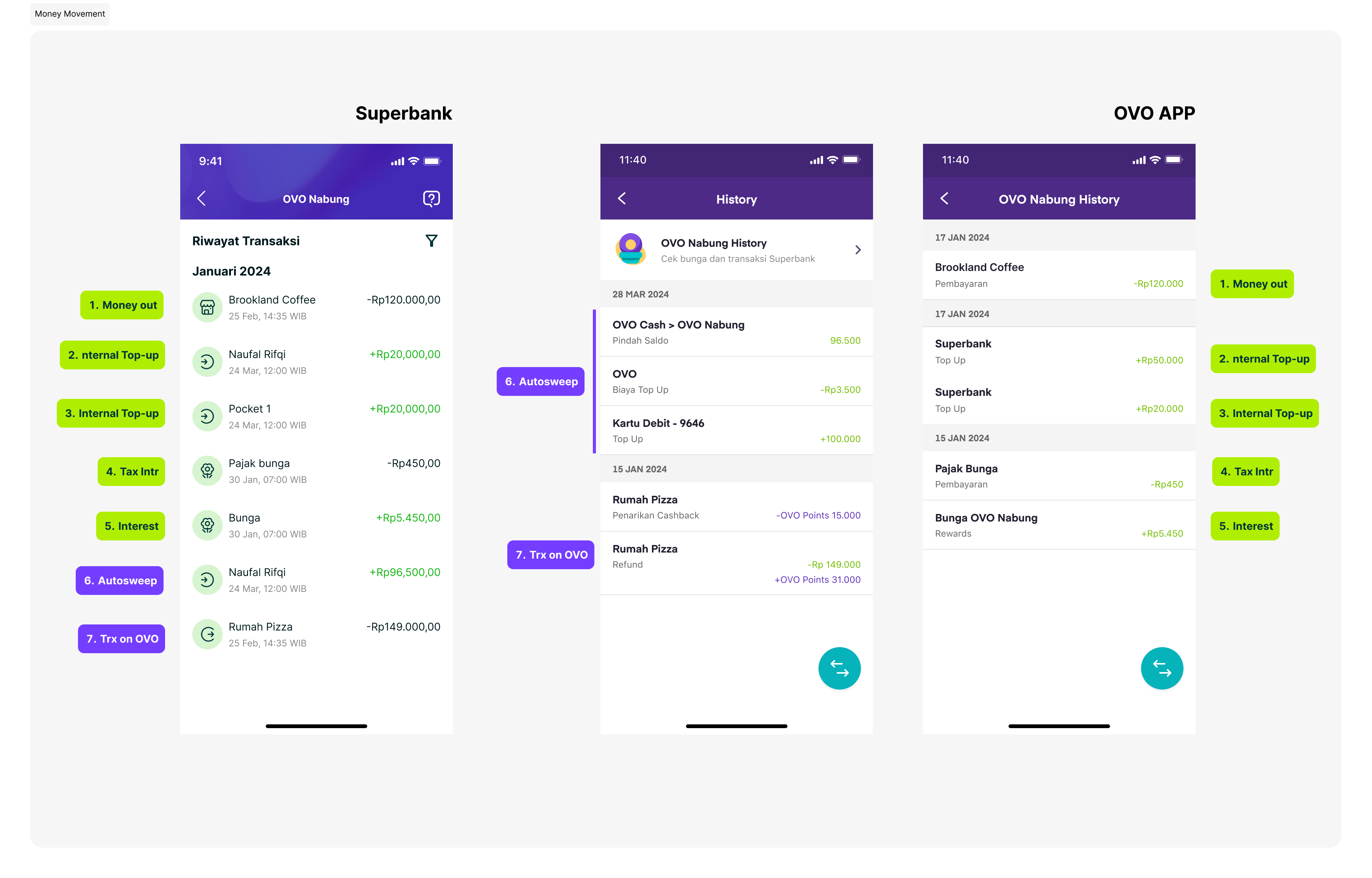
Designing transaction history across Superbank and OVO required a shared framework both partners could build on. I established core principles around consistency, clear source indication, and aligned payment flows — flexible enough to support future ecosystem partners beyond OVO.
Delivered end-to-end design on time for regulatory requirements, covering onboarding, savings, and all edge cases. Built the scalable onboarding foundation now used across future ecosystem partners.
Given the tight timeline, I made a deliberate decision to prioritize launch speed over perfecting the messaging — a strategic tradeoff between clearly communicating the CVP and simplifying the onboarding flow.
Post-MVP, I closely analyzed user feedback and behavioral data. The insights were clear: users struggled to understand the interest rate, expressed concerns about hidden bank fees, and showed early signs of trust friction. These became the focus of our first major iteration after launch.
During launch, this initiative helped Superbank reach its first 1 million users in under one year — a significant milestone for a new bank in Indonesia. As of 2026, 60% of Superbank users originate from the OVO Nabung journey.